Websites vary, both in image and intent. What works for one won’t work for another. That being said, there are some elements of responsive design that apply to most, if not all, sites and should be an essential part of all your digital marketing tools and strategies. One of these elements is the good use of “white space.”
Website design is, of course, always seeking to find a sweet spot between appearance and efficacy. Whether you are a beginner blogger or an advanced developer trying to achieve this, the challenge remains the same.
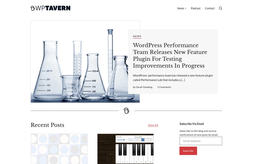
WordPress design, in particular, though, is good with white space. See WPTavern for a great example of a site using white space well. You don’t have to use a blog theme for this. Feel free to experiment.
Another great thing about WordPress is just how widely it’s used.
This results in a preponderance of users giving a wealth of tips on what makes for a readily understood website.
That’s enough opening information. Let’s draw this paragraph to a close and enjoy a little white space to create a clear delineation between this section and the next.
What is White Space?
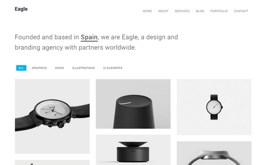
To an extent, white space is as it sounds. It is what is on the page where there is an absence of content. However, don’t be fooled into thinking that this space has to be white. No, it can be any color you like. WordPress offers excellent custom color pointers regarding what will work best in your project, including, of course, the white space hue you decide upon.

As an example, it’s worth looking at the fabulous use of color options in the white space in the National Museum of African Art site created with WordPress design. They form a quiet background that serves to complement the featured images beautifully.
So white space is a space of any color that is without, on the face of it, much function.
Or is it?
Look beyond the face, and function will appear. Just as with any design application, space can be hugely important in terms of clarity, contrast, context, and framing. We’ll look at these reasons (and others) for using white space in due course.
Types of White Space
First let’s take a look at the varieties of white space you may encounter.
Micro and Macro
The former is the relatively small amount of white space that makes comprehension fundamentally possible. This includes the space between lines of text. Without this, the site clearly won’t function as a tool of communication in any respect, apart from communicating to the user that you shouldn’t be designing websites.
The latter refers to the larger spaces between the components on view. So, the space that forms the borders of the page, as well as the space that gives breathing room to the images and chunks of text you want to be clearly appreciated and understood. And clear understanding is key to the success of your site.
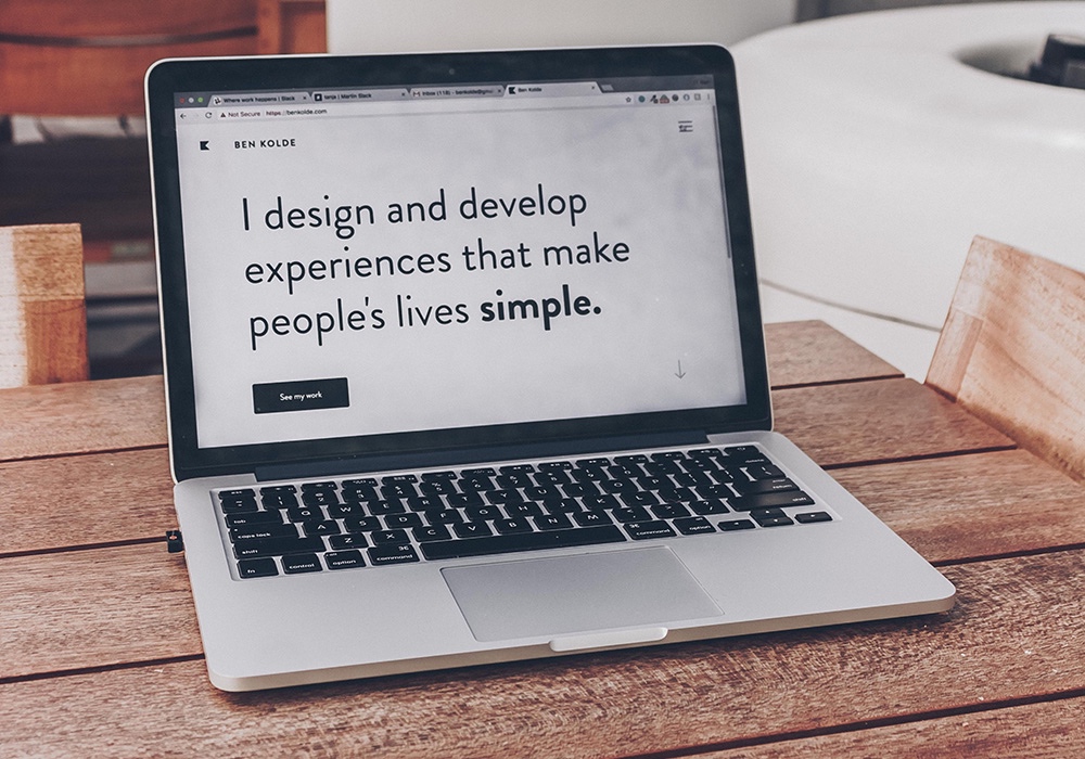
It’s easy to explore the ways of streamlining WordPress design in this area.
Passive and Active
Passive white space appears whether the designer meant it to or not. It is the automatic presence of space that the text editor will insert as you create lines and paragraphs.
Active white space is where the designer has deliberately given more room between page elements, for reasons which we will go into below. As a general rule, the more distinct the elements are from each other, the more space there should be between them. We can be very rudimentary creatures and tend to work with a “birds of a feather stick together” mentality.
Reasons for Using White Space
Now let us take a look at why white space is used in web design.
Clarity
This is enormously important; a very common mistake made by website designers is to stuff too much into a page, thereby cluttering and obscuring the central messages you’re trying to convey. Remember that a clean layout is a good layout.
In the kind of situation where design elements suffer from a lack of discipline, users are likely to face bafflement and may leave the site prematurely as a result. If you deliver a poor user experience like this, a high exit rate is what you can expect.
Over-cluttering will probably affect loading speed in the first place too, and high loading speed = high rates of abandonment.

Thankfully, there are plenty of ways to speed up WordPress.
Contrast
An image or a box of text can have far more impact if you surround it with space of a contrasting color. This sort of color scheme gives digestion space so that the user can chew over what’s being imparted before encountering the next material.
Contrast through white space can also be used to highlight a particular element of the site, thus encouraging the user to take a certain route by, for instance, clicking a CTA box.
Context
Sometimes, you will need to establish a little bit of space to prevent the misapplication of context. An unfortunate juxtaposition of a serious point and a humorous image will do neither any favors.
Framing
This is purely aesthetic. Images just look better with frames.

And a frame is effectively a space around the picture to stop other stimuli from creeping in and intruding.
Framing sounds a little trivial, but it’s massively important. For anyone looking to start an online store, part of the whole deal will inevitably be a collection of images of products. Try sticking those images hard against each other with no framing. A mess is what results. The eye naturally needs a frame in order to properly appreciate what’s in front of it. Incidentally, WordPress design has some great startup features available.
If It Works…
White space has been with us a long time. It has its roots in the approach of calligraphers and artists in early 20th-century China. Working with ink and rice paper, these craftspeople found meaning not just in what they added to the sheet but what remained empty. In the same way, silence in a conversation can be more expressive than any words, and a space on a page can convey meaning if used in the right way at the right time.
From this beginning, white space went on to characterize the modernism that became globally dominant throughout the 20th century. This cool neoclassicism continues to echo today and is a shorthand for elegance and quality. This is why so many brands use it to great effect in their image design. WordPress can deliver it in spades with its minimalist themes.
Themes and Templates
Theme designers around the world have contributed a myriad of custom theme options to WordPress users, which can help with your use of white space. Whether you want to use an ecommerce theme, a clean theme, a purely elegant theme, or a flexible theme, it’s worth taking a look at how WordPress design gives a wide variety of theme options.
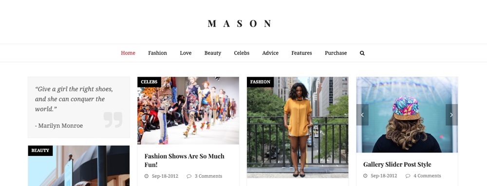
The Total WordPress theme offers a number of settings, for example, that you can use to add and customize active white space on your site. Use options for site widths, column spacing, full screen rows and more to add white space to posts and pages.
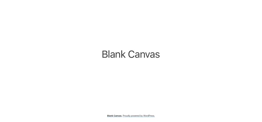
Or you can go all out with Blank Canvas, which is full-on minimalist and more of a multipurpose theme.
Templates, too, can assist with white space deployment. WordPress gives the designer some beautiful templates to use, whether you want a landing page template or something more generic.
Get the Balance Right

The important thing with white space is to achieve a successful balance. As mentioned, you can’t risk overloading the screen and the user with too much all at once. On the other hand, you need to look like you do actually have something to say and a service to give.
How much white space to use can depend a great deal on what the website is about. As with all marketing tools, what you’re marketing can shape the way you market it. Does it need much in the way of exposition? If the product is hugely well-known, then the user will not need so much contextual information.
For instance, the Walt Disney site, created using WordPress design, goes down the route of little information on the landing page. You have the Disney name overlaying an image giving a huge impact. What you definitely don’t get, and don’t need, is any information explaining who Disney is and what it’s about.
For a start-up company with new products, there will be other considerations and SaaS ideas to explore. It’s tempting for all this information to be readily presented above the fold.

However, it’s fair to say that, even if you have masses to impart, you should err on the side of less rather than more. You can always refer users to subpages with more detail as soon as they show an inclination to learn more. For an example of this done really well, see the WooCommerce landing page.
Websites are at their best when they attract attention through good looks and then turn that attention to good use by facilitating meaningful communication. As we’ve learned, the passing of information doesn’t rely solely on the volume of content. If you give everything all at once in the interest of getting data to the reader, it can result in overload.
You can streamline this with white space. And white space can be used to best effect with WordPress, whether you’re an expert designer or somebody who’s just setting out.
White space gives room, and that can be what’s necessary to get a point to hit home. Sometimes, the most eloquent part of a conversation can be the pregnant…. pause.
