If your goal is to create a WordPress site that’s both successful and user-friendly, you probably already know that you need to focus on aspects such as your site’s load speed, proper page layouts, navigation, and SEO elements. What you may not know, though, is that you also need to make your site ADA compliant.
Not sure what ADA compliance is or why you need to prioritize it when building your website? Then you’re in the right place. Let’s break down what ADA compliance is, why you need to focus on it, and how you can design your WordPress site to be ADA-compliant.
Defining ADA Compliance
Before we define ADA compliance, let’s quickly discuss website accessibility. At its core, website accessibility is the practice of improving website access for users with disabilities. It’s important that websites be designed and developed in a way that provides complete access to their functionality and data for users with or without disabilities.
ADA – otherwise known as the Americans with Disabilities Act – is a federal law whose standards require that information and digital technology be readily accessible to any U.S. citizen with a disability. Though similar to Section 508 standards, the ADA is different in that it broadly applies to organizations, both public and private (and non-profit). In contrast, Section 508 applies specifically to federal information communication technology.
Easy Tips for an ADA-Compliant WordPress Site
Now that you’re familiar with ADA compliance and why it’s important for your users, you need to know how to design an ADA-compliant WordPress site. Here are some of the most important steps you should follow.
Begin with Your Initial Design and Build
You’ll want to keep standards for accessibility in mind the entire time you’re creating a WordPress site. Even though you’ll spot accessibility-related issues during your post-build testing, you still want to make a site that’s as clean as it can be beforehand.

It’s recommended that you start by paying attention to color contrast. Per the WCAG 2.1, websites must maintain a color contrast ratio of at least 4.5:1 if they’re using text under 18pt on their backgrounds and foregrounds. For any two colors on a site’s background and foreground using text that’s 18pt or greater, that contrast ratio must be 3:1. This is easy to test by simply inspecting your website design using your browser’s developer tools. In the screenshot above you can see that the contrast for WPExplorer’s paragraphs is 14.66 – well above the minimum of 4.5.

Also important to your site’s ADA compliance are your fallback colors. Modern websites are chock-full of interesting imagery, but many users disable styling and images to access the information on a website more quickly. When a user disables images through their browser, the background of the site they’re accessing appears white. For this reason, make sure to add fallback colors to your WordPress site’s panels, be sure to add an alt text (which is used by browsers when an image can’t be displayed) and consider including descriptive text at the top of your images.
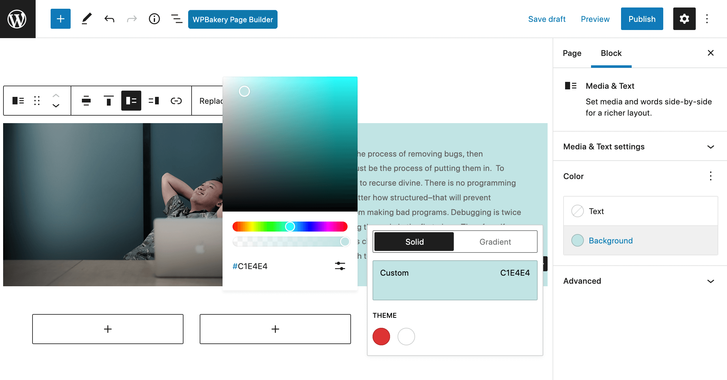
If you’re using a page builder, you can simply select a color for your block, column or row background where an image is to be placed as you’re building. You can see a Gutenberg example for a block background color above. But for themes with hard-coded templates you may want to create a child theme to add custom fallbacks or consult the theme developer if you’re not comfortable with code.

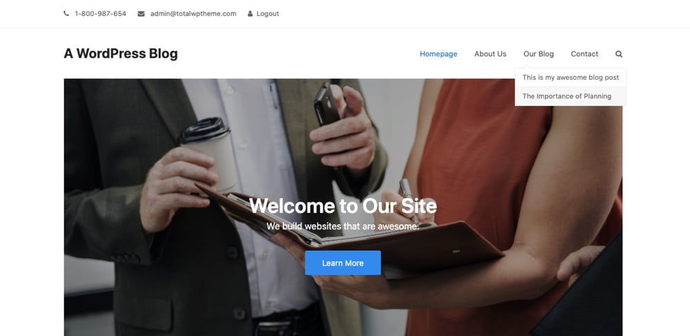
As part of your initial design and build, try to make a menu design that has multiple and intuitive options for navigation. When you create a menu in WordPress it needs to be assigned to a menu location, but depending on your theme you may have multiple or even many locations. Be sure to check all of your menus for accessibility and usability on desktop and on mobile. You may also consider linking a sitemap in your website’s footer to let your visitors access all of your site’s pages from a single place.

Additionally, you’ll want to include search functionality to allow users to use specific phrases and keywords with which they can search your website. Most themes will have a search icon already included as a part of the header design. But on the off chance your theme doesn’t then you may want to add a search widget to your site’s sidebar or footer.

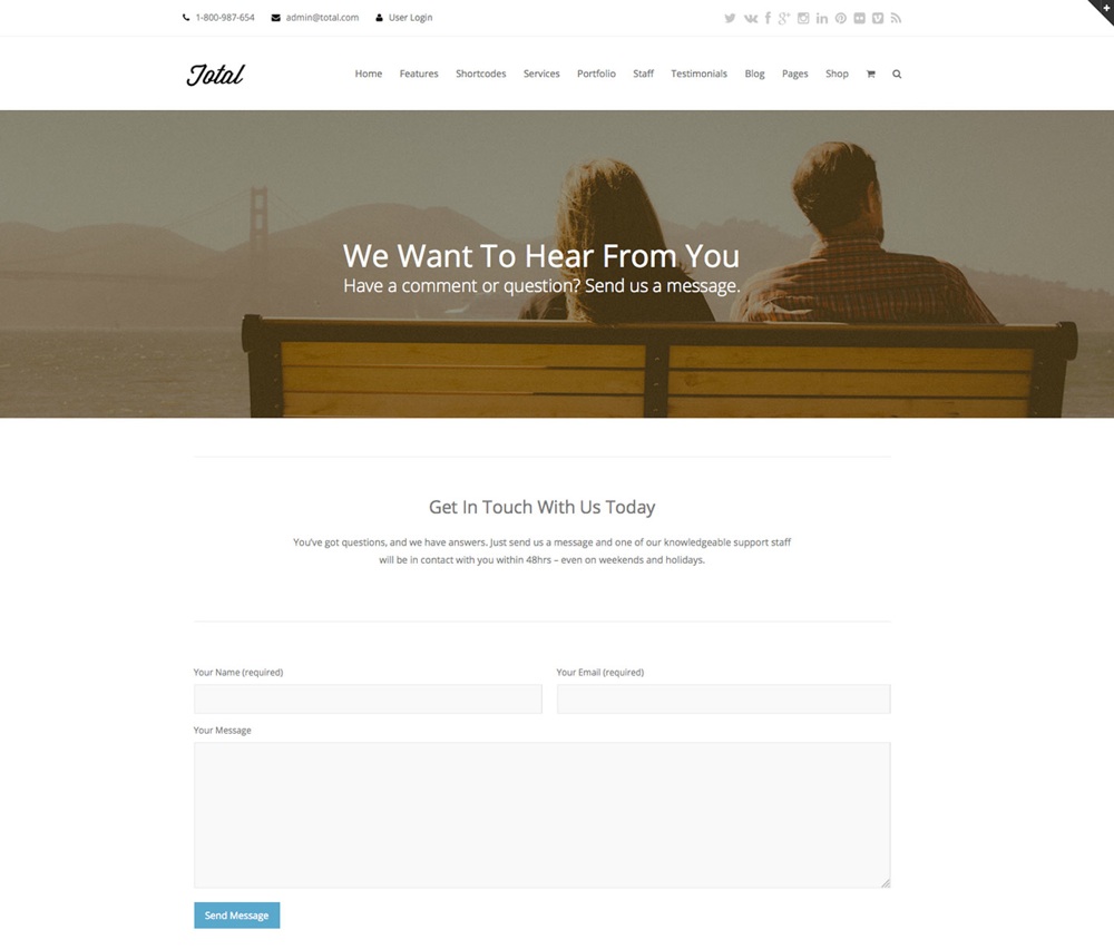
And finally, to ensure that you’re doing a good job from an accessibility standpoint, include a feedback form from your site’s footer as well. There are plenty of easy to use and accessible web forms for WordPress that you can use to accept accessibility feedback, as well as to create other forms for your site (e.g. contact form, blog submissions, user signup, etc).
Cultivate Content that’s Readable
When it comes to ADA compliance, a big hurdle you’ll need to overcome is readability. Readable content just means content that’s easy to read and understand.
Generally speaking, you should aim for around seven to ten words per content line. You should feel free to make adjustments to your font sizes and column widths as well as adjustments to text on mobile devices by using media queries. The more readable your site’s content is, the more likely your visitors will stay on your site for longer and navigate to your other pages.
If you’d like to use a standardized design to help with your content’s readability, there is no better tool than Google’s “Material Design.” Material Design focuses heavily on readability and offers website builders recommended icons, layouts, colors, and more.
It’s essential that you prevent your site’s text from being above any background colors that use alpha transparency. Failing to do this will have you running into errors when it comes time to test your site. You should use a number code that’s hexadecimal when working with colors that you place against alpha transparency.
The “alpha” in alpha transparency refers to a color’s level of transparency or opacity; it effects contrast and is represented as a zero (totally transparent) or a one (totally opaque). In the context of ADA compliance, it’s important to remember that reducing an element’s alpha will, in turn, lower its contrast and allow underlying colors to bleed through. Always design a WordPress site that emphasizes contrast between text and its background colors to optimize your content’s readability.
Embrace Reliable Best Practices
You wouldn’t want to create what you believe to be an ADA-compliant site without first becoming familiar with proven best practices for accessibility. If you don’t embrace some proven, reliable best practices when it comes to ADA compliance, you run the risk of dealing with an ADA-related lawsuit.
After you’ve tested your accessibility levels to the best of your abilities, you’ll want to tackle each issue you encounter. Take stock of the content on your WordPress site and decide whether you can create alternative outputs that can replace your existing media content, such as images and videos.
In fact, if you’re trying to improve the experience of visually impaired users (and you should be whenever possible), you’ll need to ensure that your text maintains a contrast ratio of 4.5:1 or higher and can be resized up to 200%. These users will also benefit from subtle visual indicators that are active when your site is outputting sound or from subtitles that accompany your visual media.
For your website’s physically impaired visitors and visitors using screen readers, it’s important to ensure your website has a logical tab path and clear tab focus style to allow users to easily tab through your site’s elements. Users who experience temporary and permanent motor impairments rely heavily on their keyboards for easy navigation – a logical tab order makes for seamless navigation for any motor-impaired visitors to your site.
Although it can be tricky, it’s important to strike the right balance between improving accessibility without detracting from the functionality of your site by performing usability testing. A reasonable balance between these aspects not only provides intuitive experiences for your visitors and reduces the likelihood of you getting hit with an ADA-related lawsuit, but it also increases the chance of your website earning more positive reviews online.
Creating an ADA-compliant WordPress site is undoubtedly a big deal for your brand. That said, creating and maintaining a site that adheres to ADA is an admittedly big task.
If you’re worried that investing in ADA compliance will take away too much of your valuable resources and time, remember that being ADA-compliant can boost your site’s visibility among Google’s results pages. It will also prevent you from getting hit with time-consuming and costly ADA-related lawsuits and increase the likelihood that you’ll cultivate a broader audience of customers. Do right by your visitors dealing with disabilities and invest in your brand for the long run by also investing in ADA compliance.


![How to Change Your WordPress Login Logo [w/ Video Tutorial]](https://megawordpresshosting.com/wp-content/uploads/2024/11/how-to-change-your-wordpress-login-logo-w-video-tutorial-768x326.jpg)

