If you run your own business, offer freelance services, or run a blog, you likely have a website that you created to show off your skills and offerings. A website is one of the best ways to build visibility on the web, whether you’re building your business or simply maintaining it.
One of the best ways to increase revenue or traffic to your website is to rebrand yourself. Not only can rebranding yourself and your website draw in more website visitors, but it can also help you stand out on various platforms.

Rebranding your style to better fit with the times starts with rebranding your website. Although the idea of revamping yourself may sound complicated, it doesn’t have to be.
If you use a site hosted by WordPress and want to try to revitalize your image, you’ve come to the right place. The steps outlined here can help you learn how to rebrand a WordPress website in a way that will best suit your business.
How to Rebrand a WordPress Website: Seven Essential Steps
In order to rebrand a website in WordPress seamlessly, there are seven steps you should follow. These steps will help you rebrand a WordPress theme, define your image, and create a website experience that makes your business stand out.
Develop Your Brand Voice
First and foremost, you have to know your brand voice. Your brand voice is the best way to convey your authority on your topic. Conveying your authority could come in the form of written content, physical products, or other delivery methods, such as podcasts.
For example, if you run a political website, using political jargon and confident verbiage will tell your target audience that you’re well-versed on your topic. Or, if you have a pop-culture podcast, there should be no question that you know the who’s who of the pop culture world.
If you’re looking to expand your voice, you could consider adding a blog. Many articles are available to get you started if you’ve never created a blog before, but it can be a great way to get noticed for something brand-specific, like witty one-liners or great storytelling.
This should be in line with your business industry, objectives, and the audience you are speaking to. If you need help with defining your brand voice, which is key to any rebrand or design project, you may want to seek out a consultation with a branding consultant. You can find plenty of great consultants on Clarity FM.
Define Your Style
The next step to learning how to rebrand a WordPress website is to figure out your style. This is the part of your website that conveys who you are. It should be apparent in your logo, theme, and writing.
Essentially, your style is the “you” part of your site. It’s how site visitors learn about your business and understand who you are. Perhaps your business style is an offshoot of your own personality, or it might be the complete opposite of who you are. The only thing that matters is that it’s clearcut.
For example, if you’re an author of romantic comedies, you may want to portray yourself as funny and personable using bright colors and witty text. Or, if you’re the owner of a clothing store, a style that conveys the casual vibe of your clothing would be more appropriate.
When defining your style, take time to look at competitors’ websites and examine the styles of the more successful ones to get some great insight into what consumers are looking for. Once you have an idea of what your target audience is used to, you’ll have a great starting point.
Align Your Brand Voice and Style with Your Offerings
This may seem obvious, but it is vital to create your new style, voice, and overall branding to resemble and reflect the industry your business is in and the products or services you offer.
You will not be recognizable or memorable (in a good way, at least) to your audience if you have a new branding and style that has zero characteristics of the market your business is in.
An example of this being done poorly would be a pediatric doctor’s office using a “car” in their logo or branding. Sure, kids usually like cars, or toy cars at least, and maybe the doctor is even a car geek. However, it’s obvious that a “car” doesn’t speak to what a pediatric doctor has to offer.
The better example of the pediatric doctor’s office having a good alignment of their brand and style with their offerings would be using a classic toy from their culture, the traditional baby blue and pink colors, or even a fun and energetic font for a wordmark logo.
Additionally, you will want to consider how the design will flow with the purpose and function of your website. If your website is intended to be a showcase of your creative work, you will want to have that creative touch with your branding too. If your site is more for information only purposes, then you will want to focus on presenting that information in a clear and distinguished way.
This step may seem easy, or again, obvious, but when working through new designs and branding, it can be easy to get “caught in the current” of making something new and exciting. Remember your objectives when rebranding, and stay focused on creating something that represents what you have to offer your audience.

Create Your Logo
Your logo is the most outward and immediate expression of your style and brand. It should appear on every page, on every platform, and on every piece of digital marketing material. That way, when someone visits your site, they’ll know they’ve come to the right place.
Creating a logo can take quite a bit of trial and error, especially if you’ve never done it before. You can create a logo yourself using a free service such as Canva, or, if you’re handy with Photoshop, you could also create a logo using that.
If you aren’t sure if you’ll be able to create a logo on your own that really stands out, it’s a simple enough process to hire someone to do it for you. Graphic designers are available to create logos, advertisements, and other digital promotional materials and have the experience to do it well.
Create a Favicon
Once you’ve created a great logo, your next step is to create a Favicon.
A Favicon is a small icon on the tab of a browser that tells you what site is on the browser without switching to that tab. For example, the Favicon on the WordPress website is the WordPress logo.
When designing your site, you should include your logo as your Favicon. Choosing something other than your logo can confuse site visitors.
WordPress makes it incredibly easy to use your logo to create a Favicon when customizing your theme. Or, if you prefer, you can convert your logo to a Favicon using an online conversion tool.

Choose a Theme With Suitable Branding Options
WordPress provides you the option of either using a pre-designed theme or creating your site from scratch. If your goal is to remain consistent and recognizable, choosing a theme is your best bet because it allows your style to carry seamlessly through each page on your site.
Whether you’re choosing to rebrand a pre-existing WordPress theme, choosing a new theme altogether, or using a page builder like Elementor* or Beaver Builder*, be sure you select a theme that has suitable branding options for your needs. Some themes are more customizable than others, which gives you more flexibility when creating your site.
You want to make sure the theme allows you enough customization options to be able to implement your branding options on the site without a lot of custom development. Also, to keep things consistent, make sure the color scheme you choose for your theme reflects your style and complements your logo.
When considering your theme options, you need to remember that you’ll have to keep your site up to date. WordPress makes changes now and then, and one core update or theme update could conflict and change the look of your entire site. Make sure you go with a highly rated and supported theme that is kept up to date and checked for compatibilities, like the X theme or any of our other recommended themes, or a commonly used page builder and theme combination.
But, no matter what theme you have or choose to go with, you can always have help with maintaining theme updates, on top of all your other updates and maintenance tasks, with a WordPress care plan if you’re concerned about managing a theme and the WordPress system.
Lastly, you don’t have to have a custom theme built to have a great custom design for your site. We really don’t recommend using a custom theme for most websites. Many of the best, well-known themes now have plenty of flexibility to implement your design ideas, so don’t feel pressured into an expensive custom-built theme.
Consider Your Cross-Platform Branding Options.
Once you’ve figured out your style, brand, logo, and voice, there’s one more step in the rebranding process. Having a website is excellent for business, but only if you get the word out that it’s there. The best way to spread the word is to implement cross-platform branding.
Cross-platform branding is one of the most common ways to spread the word about your business, which you’d mainly do through social media. Twitter, Facebook, Instagram, and TikTok are a few of the big platforms that successful content-creators and business owners use.
One example of cross-platform branding can be seen on our own WP Buff’s Instagram and Twitter pages. The first thing you see is the bright colors of WP Buff’s logo and theme, highlighting one of the most critical aspects of this type of branding: consistency.
The biggest thing to remember about using social media for cross-platform branding is that not all platforms are created equal. For example, Instagram is more about visual content, whereas Twitter requires you to be witty and concise when drawing in your target audience.
When choosing which platforms to focus on, always look at demographics regarding user behavior. For example, based on this Pew research data, 71% of women aged 18-29 use Instagram, but only 48% of women aged 30-49 use that platform.
This data indicates if your target audience is in their forties, you may want to spend more time getting the word out on Facebook, which is used by 77% of women in their thirties and forties.
So now that we’ve laid the basic foundation of how to rebrand a WordPress website, let’s talk about our own journey for the WP Buffs website rebrand we went through!
The WP Buffs Rebrand
Rather listen than read? Tune into the podcast where Christie and I review this whole blog post, or the episode where we do a full walk through of the new site!
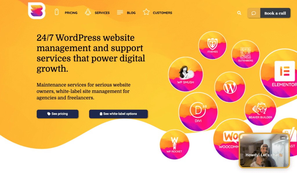
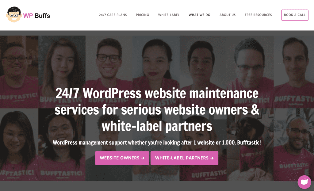
As you’re probably already aware reading this blog post, wpbuffs.com has gotten a major update. Not only have we brought WP Buffs into the present with fantastic new branding, but we launched a new website to boot.
While our name and domain have stayed the same, just about everything else about WP Buffs has gotten a significant facelift.
And most of the work was done while I was on parental leave! So huge kudos to our whole team who got this mammoth project completed (and especially to Nick for leading the charge).
I wanted to write this section of the blog post to describe everything about the rebrand and new website. Our thought process, the whys, the different stages of design and development, the costs involved and much more.
So let’s dive in.
The whys
There were a few reasons we decided to do this. I think many of the reasons for the rebrand and the new website are overlapping, but some factor more into one than the other so I’m going to talk about them both separately here.
The rebrand
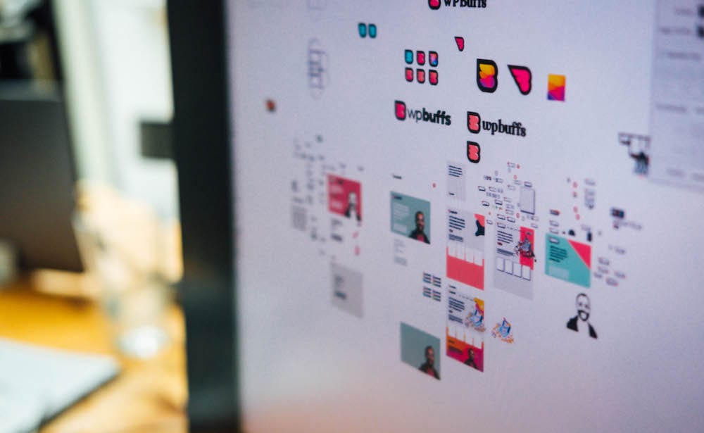
- Our old logo was done on Fiverr when I started WP Buffs ~6 years ago. That doesn’t automatically make it bad, but WP Buffs has changed a lot since then. Our white, male character didn’t describe our remote and extremely diverse team well (it never did, honestly). So…time for something fresh!
- We’ve raised our pricing 4 times over the past 6 years. We don’t cater to folks who are looking for the cheapest WordPress support anymore. With this new look, we can continue to instill confidence in potential customers and keep our higher price point while impressing with a new site.
- Handing over the keys to your website (or your clients’ websites) is a huge deal. So when you land on our website, you HAVE to think, “I can see myself trusting this team.” The new site does a much better job of presenting that wow factor that people want to feel when they land on the website of a company they’re thinking about working with.
When I showed the team the new branding, they were beyond pumped! That’s something I think will help continue to motivate our team to do great work and really continue to live up to the expectations set by the new wpbuffs.com.
And in the same vein, I hope the new site will help us to recruit more great talent onto our team. As we grow, our challenges become more complex and we need to bring in driven folks who can get the job done. Psssst…we’re hiring!
The website
So I’ve talked about why the rebrand. Why the new website with it?
- When was the last time you saw a company rebrand and not launch a new website? Never. It wasn’t an option to invest in brilliant new branding and then put lipstick on a pig when it came to our website. So we went gung ho and updated everything.
- A lot has changed here at WP Buffs over the past 6 years when it comes to the contents of the site. We’ve added things like webinars, case studies and customer stories since the site was originally built. Plus we started offering our most popular (and profitable) white-label support. While forcing all this into our old site was possible, it would have been like trying to fit a square peg into a round hole. It was easier to build out a new site that could work around our offerings than the other way around. Navigation and UI/UX was a bit of a mess so starting from scratch was a good way fix this core challenge of our website visitors and potential customers & partners.
- We manage websites. So folks have to think we take care of our own website. That means having a site that people think is super dope immediately when people land on it. Our new website (and branding) definitely does this!
- Most of the elite companies you know about in the WordPress space have a fantastic website. Our old templated site just wasn’t doing us justice and it was time for a change.
- Our old site was pretty bloated and not as fast as I would have liked. At least 1x per month, someone would message us that it was stupid that we do speed optimization and our site on a random online optimizer loaded in 12 seconds. The new site is leaner, faster and much quicker to load (the video you see in the bottom right corner on desktop is causing an extra ~2 seconds of loading time but we’re trying something new so give us a break!).
- One final reason I’ll give is that I wanted our website to make WP Buffs somewhere our team was really proud to work. As someone who works remotely, I know the importance of sending people to the website of my company and wanting them to be impressed.
The journey of our new brand
Once we decided to go for it, we went in search of designers with very specific objectives:
- We obviously needed folks who could deliver on our vision. That meant a jaw-dropping portfolio and excellent referrals.
- We needed a team who could walk us through the discovery processes. We’re WordPress experts, but not necessarily design pros! This meant a team that could take a lot of information in a discovery call and distill that conversation into fantastic designs that met our needs.
- We wanted folks who could deliver on our timeframe. We didn’t want to rush this project but our goal was to finish the design phase in 4-6 weeks so we could get started on dev.
We ended up going with our first choice all along. I used to be in a little monthly mastermind with Brad Touesnard from Delicious Brains. They rebranded all their plugins and he mentioned the company he worked with on all of them. I loved the work (and the blog post Brad wrote about it – thanks for motivating this one, dude!).
So it ended up being an easy decision to go with Dose.
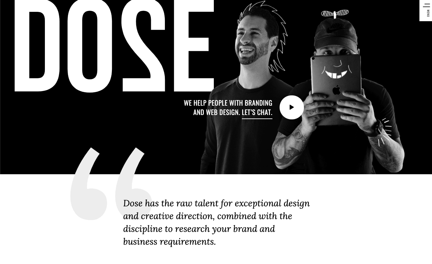
Honestly, these guys made the rebranding process so, so easy. After a comprehensive discovery call, 3 unique art directions and a little emailing, they delivered 2 fantastic rebrand options for us.
And what you see on the website is almost exactly what we chose in that presentation.
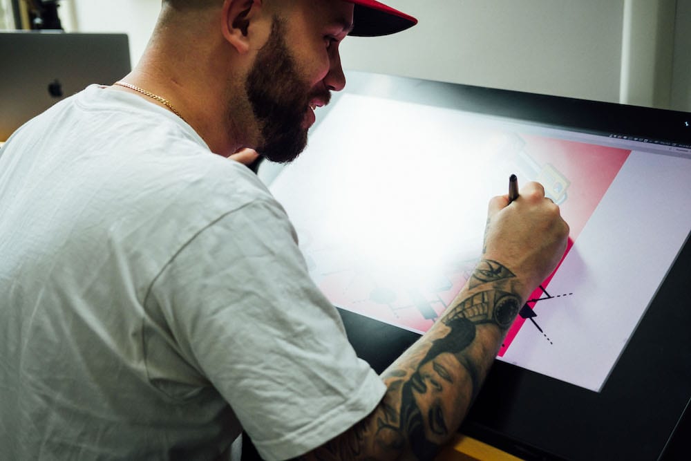
Cost: Keep reading for full branding and web design cost.
Getting our new website designed
I spoke with a few people in the WordPress space about designing a new website for us from the bufftastic rebrand material. I even cornered Bill Erikson at PressNomics and just about forced him to introduce me to the designers he works with.
After shopping around for about a month, we decided to give the project to Dose! They’d done such a great job with the new branding, we thought letting them design our new website was the best option since they’re already had so many touch points with (and were the brains behind) all the design work they’d already done for us.
Plus, I was getting analysis paralysis. So I just pulled the trigger!
After another thorough discovery call and ~3 weeks, they delivered a new website design that really knocked our socks off.


Cost: $20K for new branding (logo, patterns, fonts, complete brand guide) AND new website design delivered via Adobe XD and original designs for every team member.
Dose Media was the perfect option for us. If you are looking for a partner to help you with a rebrand, we highly recommend Dose! Or, you can also get some highly vetted options by visiting Get Credo* – an amazing resource for finding branding, marketing, and content partners.
Building the new site
We did all the dev of the new wpbuffs.com in-house! Shout out to Nick for leading the effort and Jason & Honey for all your hard dev work.
The dev did take a bit longer than expected since dedicating internal developer time to this project meant less time spend on customer work. But Nick found a good balance and we put 90% of the site together in ~2 months.
We built the site on Elementor*. The pace at which they’ve released new features impressed us. That’s a huge reason we felt like they were the right technical choice and will continue to be so in the future.
We went with a page builder because we wanted to build a site us non-technical folks could make updates to ourselves without asking for someone technical to help. For example, Elementor will allow our marketing team to throw up new landing pages in just a few minutes using a pre-built template and pre-defined blocks. Dope!
I thought about putting together a super-fast headless site after chatting with Scott Bolinger about it, but it would have taken away the advantage I talked about above. Plus, we manage WordPress sites and it felt like our website should be pure WordPress.
Cost: ~$4K of time spent to build out the new site (including buying some premium plugins, etc).
If you are looking for a development partner to do build a new site, again we would recommend using the partner network at Get Credo*, or a well-known WordPress player such as Themeco.
Preparing for launch
Just building the new site was one thing, but preparing for the launch was a real beast. And being mostly on parental leave made it even more of a challenge!
SEO
First and foremost, we had to make sure we had a solid plan to launch the new site from an SEO perspective. 80%+ of our traffic, new sales calls and new customers find us through Google searches, so I can’t stress enough how important it was that we make this transition cleanly.
We worked directly with my friend Lindsay over at webShine. They supported our SEO efforts during this transition and they made sure things like URL structure, 301 redirects, internal linking, etc remained solid.
But avoiding a disastrous drop in traffic was only the start for us. We want the new site to actually enhance our SEO efforts. That’s why we revamped our tags & categories, redirected a significant amount of dead pages, cleaned up our XML sitemap, etc.
Software
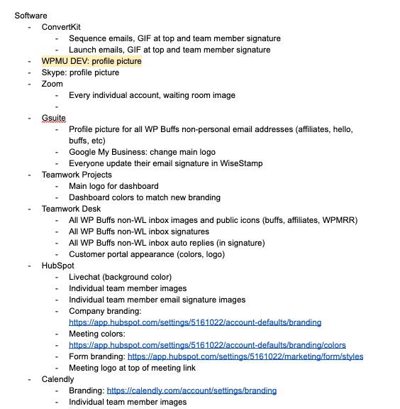
And of course there were all the little logo changes we had to make in all the software we use. Logo in Stripe for invoices, HubSpot for sales emails, email signatures in Gmail, Teamwork Desk for support emails, Zoom for sales call waiting rooms, and a ton more places.
Here’s just part of the list of all the updates we’ll make immediately after launch. Hopefully they’ll all be updated by the time you read this article!
Ongoing design
We knew with our newly designed website and new branding that we had to step up our overall design game moving forward. That’s why we partnered with ManyPixels. We had cool images created for all the folks on our team, got new featured images created for all of our blog posts (some may be updated post-launch), redid our eBooks & case studies and took care of all our design needs with one monthly subscription.
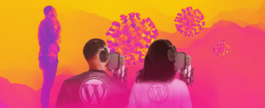
You may have seen some sneak peeks of our new branding if you’re a listener of our WPMRR WordPress podcast. We’ve been giving our new branding nods in featured images there for months now!
Email & social
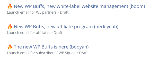
We also prepped emails to all our different customer segments in ConvertKit. Direct customers, white-label partners, affiliates and general subscribers.
We also did a full run through of our sequences and added our new super dope fire emoji logo to the top of every email we send out. This will be a nice, minimalist nod to our new stuff for our email subscribers.
Of course we planned to update our social pages (Facebook, Twitter, LinkedIn, Google My Business, etc). We also plan to share some of our new stuff over on Twitter so check us out there if you want to stay updated.
Affiliate program
We also made a major change to our affiliate program which we had to get ready. Instead of one-time payouts, all our affiliates (who get signed up on ShareASale) will now earn 10% forever recurring monthly commissions.
We also relaunched our entire affiliate on ShareASale. If you’re already a WP Buffs affiliate (or want to be one), please make sure you get signed up for our new, more lucrative program.
In our old model of one-time payouts, a referral of 1x Perform Plan awarded $100.
In our new model, a referral of 1x Perform Plan awards $571 ($19.70 x 29, the current lifetime value of WP Buffs customers in months based on user churn).
So, clearly this is more lucrative for our affiliates!
And it’s great for us because the model will mean affiliates do well financially when they refer customers to WP Buffs who stay with us for a long time.
Shout out to Brian Jackson who said switching over to the referral model from one-time payouts has had a big impact in growing affiliate referrals over at his former company Kinsta.
Acquisitions
Another big step WP Buffs is taking in 2020 is into the world of acquisitions and buying other WordPress businesses.
We’ve set up a nice landing page that details the unit and the kinds of businesses we’re interesting in bringing into the Buffs family.
If you’re running a care plan business or a WordPress blog and are at that point of still loving your business even though you’re running out of steam, let’s chat.
Swag
Yep. We just couldn’t help ourselves.
Check out store.wpbuffs.com to grab some swag from our new WP Buffs store.
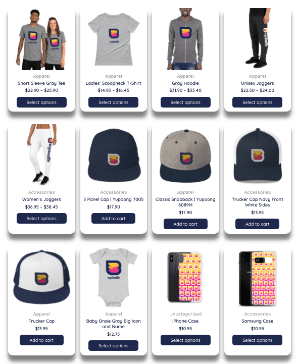
All store revenue goes to WHO’s COVID-19 response fund.
Mistakes made along the way
This process obviously didn’t go flawlessly. When does anything ever. Here are a few areas we definitely could have done better on.
- I spent too much time deciding if Dose was worth their price tag. They weren’t cheap but i should have thought about this as a 10-year investment instead of eating into our 2019 revenue for $20K. Lesson learned: find the right folks for the job and pull the trigger.
- I handed over the website build to Nick without really going through all the development details with him. He’s technical enough to push a team to get it done, but I did a pretty terrible job helping to PM everything. We never had a real due date and the organization around the entire build was a bit haphazard. Lesson learned: help build structure around a project before fully handing it off and going on parental leave.
- When I came back from parental leave, I pushed forward on the website without regularly communicating regularly or clearly enough. Every minute of the ~150 hours of dev time it took to launch this site took away from time we could have been spending on customer and partner work. This fine balance requires great communication between project leads. While I tried to make sure this went smoothly, there were definitely times where I stretched the team and made us sacrifice some desk hours for website hours.
My expectations for the future
So…the new site is launched!
What now?
The true goal of the new site and branding from a business perspective is to help our marketing team (Paraic and I) hit our KPIs.
Here are the areas I’m hoping the new site and branding will push us forwards. I’ll update this area monthly so folks can see the effects we’ve seen from all the updates.
- Increase website traffic: I’m hoping a faster site will help us rank better in search engines, plus the new, badass feel will improve things like time on page, pages per visit (and decrease bounce rate, pogo sticking, etc).
- Generate more leads: more traffic and higher trust factor in our site should translate directly to more people live chatting with us, joining our email list and scheduling calls.
- Schedule more sales calls: A professional website with high trust-factor will hopefully mean more folks will think, “hell yeah I want to work with them. Let’s get a call on the books.”
Will the new site help us improve in all of these areas?
Will it help us improve in any of these areas?
Honestly…I have nooooooo idea.
But I do know that all the feedback we’ve received up until now has been positive. Folks do seem to love what we’ve done and hopefully we can make it work for our team and business.
Our goal continues to be wanting to put ourselves in a position to be one of the leaders in the 24/7 WordPress support space. This big upgrade to WP Buffs has helped us take another big step in that direction and I’m confident it will keep helping us push forward for years to come.
Some actual results (10 days after launch)
Here are some of the positive results we’ve seen since the new website launched.
This is only ~10 days of data so the sample size is still small. Also this could just be the result of some excitement around launch. Who knows!
1. Monthly recurring revenue
In the 30 days of April, 2020, we brought on $3,628 of new monthly recurring revenue.
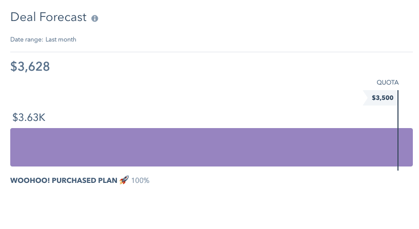
In the first 8 days of May, 2020, we brought on $4,662 of new monthly recurring revenue.
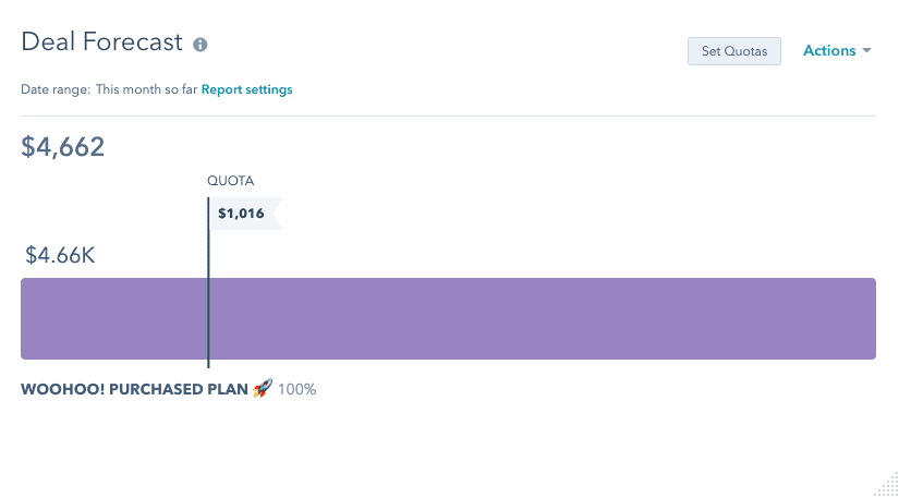
That’s a 482% increase in MRR we’re able to add to WP Buffs. Wow!
2. Sales calls
In the 30 days of April, 2020, we had 96 discovery calls scheduled with us.
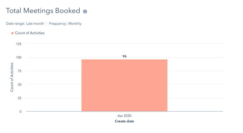
In the first 8 days of May, 2020, we had 44 discovery calls booked with us.
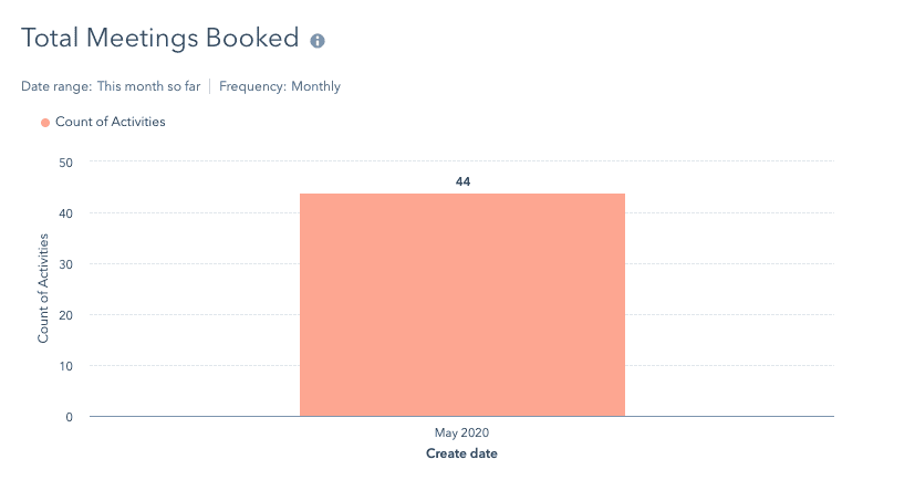
That’s a 172% increase in discovery calls booked. Oh yeah!
3. Website traffic
We’ve also seen some great results for the folks coming to the site.
Let’s take a look at the most basic of Google Analytics dashboards.
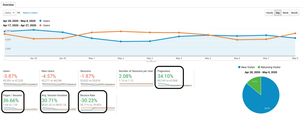
- Overall traffic, users and sessions are slightly down. I’m not that worried about this since ~10 days is such a small sample size when it comes to general traffic. Over smaller time periods, it goes up and down so I’ll report back here when I can really look at initial month-over-month data.
- Pageviews are up 34% and pages / session are up 37%. That means with almost the same traffic as before launch, the same number of people are looking at more pages on wpbuffs.com. Score!
- Average session duration is up 31%. This could mean a lot of different things, but I know it means people are spending more time on the site and reading more. That’s a good thing.
- Bounce rate is down 30%. That probably means visitors are more attracted to the new site right when they land on their first page. Far fewer folks are thinking “this site isn’t for me” when they see it for the first time.
While this is only 10 days of post-launch data, it’s definitely an indicator that we’re moving in the right direction and the new wpbuffs.com is playing a significant role in that.
More actual results (30 days after launch)
Here are some results that are probably a little more indicative of how the new website is affecting sales, marketing and website traffic.
After 30 days, the sample size is significantly bigger than just 10 days post launch (when launch ferver could have been skewing results).
In the 30 days since launch…
- we brought on $7,171 of new monthly recurring revenue. That’s a 198% increase in MRR we’re able to add.
- we had 141 discovery calls. That’s a 147% increase in discovery calls booked.
- pages / session are up 17%.
- average session duration is up 13%.
- bounce rate is down 13%.
As expected, the increases were not as big as the 10-day post launch numbers. But they still show significant improvement and that our website is doing its job far better than the old one.
More work driving more traffic and improving conversion coming soon.
Onward and upward!
People Also Ask – FAQs
Can you white label WordPress?
White-labeling, or the process of removing all WordPress branding from the back end of your WordPress site to make it more user-friendly, is easy for your web designer to do for you. White-labeling can be done by adding code or using a plugin.
What is white label WordPress theme?
A white-label WordPress theme is a plugin that allows you to easily white-label a WordPress site. It will enable you to match the style of a website to the admin dashboard. Tying the front and back ends together by incorporating the same theme allows for a more user-friendly experience.
Is WordPress still used for websites?
WordPress is still commonly used for website creation. There are unpaid plans that provide limited flexibility and paid plans that allow you to use your own domain name. Being able to use your own domain adds a bit more professionalism to your website.
