December Edition
It’s been almost a month since we released Calypso and the response has been great from the community. For those following the project more closely, we’ll be publishing summaries on new developments, focusing on framework-level improvements, new components, and the tools contributors have to work with.
Making Calypso more welcoming for developers and designers
If you install Calypso locally and point your browser to calypso.localhost:3000/devdocs/welcome we have a new developer flow that introduces you to our documentation. You can access the docs anytime from the environment badge in the lower left corner, which also highlights the git branch you are in:

Framework
- Upgraded to Node v4 and React 0.14.
- Started implementing Redux, a state container solution to manage data flow in the application. If you are interested in this, we are gradually moving our different data modules to Redux.
- We refined and documented our approach to components.
- Began exploring how pluggable modules could work in Calypso.
- Continued migration to use svg icons everywhere instead of the old icon font. We added a few new gridicons as well.
New components and updates
Components are the building blocks of the Calypso UI. We constantly refine them and build new ones, from simple user interface ones to those carrying more complex functionality. This allows us to craft interfaces that are consistent and rich. You can check out all of these if you go to calypso.localhost:3000/devdocs/design, our live components gallery. These are some of the updates we did this month.
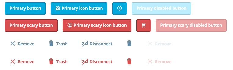
Button
We added a borderless variation for one of our most used components.
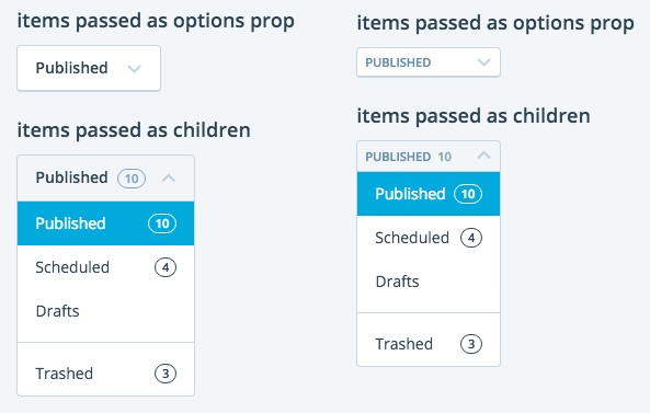
SelectDropdown
Added a compact variation.
Interval
A utility component, primarily meant for setting up a poller interface wrapping another component.
SitesDropdown
A dropdown component for selecting a site, which includes instant search, handling of private sites.
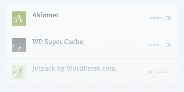
FeatureExample
A component that renders other mocked components with a faded effect to illustrate a section when for some reasons the user cannot access it.
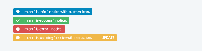
Notices
Consolidated Notices into a single component in components/notice. Also added a new compact variation with flex-box magic for narrow layouts:
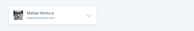
Site
The core component to display a site-card now support a homeLink prop which turns it into a link to the homepage of the site and renders the following icon on hover:

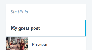
Draft
Component used to render individual post items. Now supports a “selected” prop to highlight a single draft in a list. (Used in the editor.)
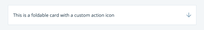
FoldableCard
Now also support custom icons.
Stay tuned to this blog for upcoming Calypso news and updates.


